After watching two specific videos on Good.is, "The Hidden Cost of War" and "The State of the Planet," I realized how similar a lot of typographically dominate motion graphics seem to blend together after awhile. Granted, the content of the two videos were really interesting because of its political content, I found the transitions and sound effects of "The State of the Planet" to be distracting, and the first minute of "The Hidden Cost of War" with its collage, changing camera effect typography done and done. But, I did like "The Hidden Cost of War" when it incorporated type and simple illustrated objects, specifically how words moved in accordance to the illustrations. But let's be real, I mainly appreciated the intro "Transparency" productions snipet, just because of its wittiness.
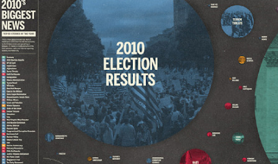
I appreciate Good for its infographics mainly though. For the fact that they are neatly organized in different categories like food and politics, business, and action and whatnot. I have a soft spot for a nicely done graph like the next person. My favorite, however, would include a few of the following:


No comments:
Post a Comment