New Behance Project uploaded for Illuminated Letter Project!
Thursday, December 16, 2010


Process for Illumination
Artist Bio, Books borrowed from Library, Why I chose Malevich, Tschichold, and Thompson:
I chose graphic designer Bradbury Thompson because I really like his layering of color, how the simplicity of his graphic images make his work so visually interesting. In the pieces that I posted in older blogs, I really like how many different colors he’s able to create by combining the cmyk color system.
“Bradbury Thompson : the art of graphic design” by Bradbury Thompson
“Nine Pioneers in American graphic design” by R. Roger Remington
“Inspirations for graphic design” by Bradbury Thompson
Bradbury Thompson’s formidable career as a graphic designer spans more than fifty years. Hes designed more than ninty stamps marking him the most prolific of american stamp designers. Thompson didnt limit himself to the traditional fine arts in looking for visual inspiration. He has explored and expanded the relationship of type with photography, with primtive and folk art, and even with the evanescent patterns of the performing arts and children’s play. Hes adapted the fine arts to his own use in innovative ways:exploring new combinations of type and image in Westvaco Inspirations: reusing period engravings to illustrate classic american books: illustrationg with old master paintings King James Bible.
He designed over fifty issues of Westvaco Inspirations for Printers, a periodical published by the Westvaco Corporation between 1925, and 1962 as a showcase for its printing papers, with thompson’s direction it became one of the leading avant-grarde publivations in the field, its influence reacing from San Franciso to Milan.
The principles Thompson developed in his work for inspirations and art news were later refined and restated in the books he dsigned in the sixties and seventies- particulary the celebrated Washburn College Bible of 1979.
When Bradbury Thompson began teaching at Yale in 1956, it was really a continuation of the teaching he had been doing by example since 1939. like all designers, he depends on intuition as well as principle, but intuition by definition is innate and cannot be taught. It has been Thimpson’s seach for principles and his generosity in sharing his discoveries that make both his teaching and his work as a designer so remarkable.
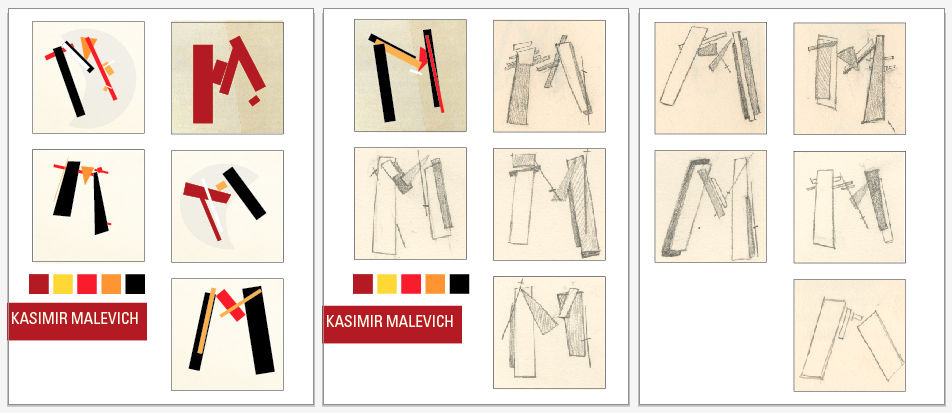
I chose suprematist Malevich because I love how he is able to imply depth and dimension through his simple rational, rectangular shapes. I love his warm color palette and wanted to create a drop cap that would imply the same geometric, mechanical usage of line and shape that is so apparent in his paintings.
“Kazimir Malevich and the art of geometry” by John MIlner
“Kazimir Malevich” by Charlotte Douglas
“Kazimir Malevich” by Alison Hilton
The Russian painter Kasimir Malevich (1878-1935) founded suprematism and is credited with having painted the first geometric, totally nonrepresentational picture.By 1913 he had so transformed his material that recognizable imagery had disappeared, though inferences of light, bulk, and atmosphere had not. Later that year he carried abstraction to its ultimate limit: he painted a black rectangle on a white ground. This, the first suprematist work, according to the artist, expressed "the supremacy of pure feeling in creative art."
Around 1913, Malevich confined himself to arrangements of geometric shapes with the goal of suggesting such sensations to the beholder as flight, wireless telegraphy, and magnetic attraction. In 1918 he painted a series of white-on-white suprematist compositions. The following year he had a retrospective exhibition in Moscow and also took over the directorship of the School of Art in Vitebsk, which he renamed the College of New Art.
In 1929 Malevich had a retrospective exhibition at the Tretyakov Gallery in Moscow. During the last years of his life he painted fewer pictures, and those he did were portraits, mostly of his family and friends. He died of cancer in Leningrad and was buried in a coffin that he himself had decorated with suprematist motifs.
I chose typographer Jan Tschichold simply because I just am in love with his work. I think his usage of typography and collaboration with photography is exciting and streamlined in its beauty. I am attracted to his use of the grid to layout his compositions and wanted to imply his past compositions using the first letter of his first and last name.
“Jan Tschichold: master typographer: his life, work and legacy” by Cees W. de Jong
“Jan Tschichold: posters of the avantgarde” by Martijn f. Le Coultre
“Jan Tschichold: typographer and type designer”
“Jan Tschichold: typographer” by Ruari McLean
Jan Tschichold was an important 20th-century German graphic designer who also gave a major impetus to the Swiss school. Jan Tschichold attended the "Akademie for Grafische Künste and Buchgewerbe "in Leipzig from 1919 until 1921. In 1923 Jan Tschichold visited the Bauhaus exhibition in Weimar. Influenced by the new Bauhaus typography, Jan Tschichold began to use serifless typefaces and designed simplified layouts.
In a special 1925 issue of "typographische mitteilungen" entitled "elementare typographie", Jan Tschichold introduced in the form of theses the most important approaches to the new typography design. From 1923 Jan Tschichold freelanced as a commercial graphic artist; his clientele included Insel Verlag publishers.
From 1926 until 1933, Jan Tschichold taught typography at Paul Renners Master Classes for Book Printers in Munich. In 1933 Jan Tschichold emigrated to Switzerland, where he worked for several publishers in Basel and taught at the School for the Applied Arts. In 1946 Jan Tschichold went to London, where he was art director at Penguin Books until 1949. In 1950 he returned to Switzerland. Between 1955 and 1967 Jan Tschichold worked as a design consultant for the Basel pharmaceutical company Hoffmann-La Roche.
Wednesday, December 1, 2010
Tuesday, November 30, 2010

Sunday, November 28, 2010


Wednesday, November 17, 2010
6 Designers
My 6 Designer choices for Illuminated Letter Project (in no particular order)


1. Tamara de Lempicka
2. Saul Bass
3. Kasimir Malevich
4. Jan Tschichold
5. Bradbury Thompson
6. Rene Magritte
The Illuminated Letter

The Illuminated letter is an embellishment on a written page, it is derived from the idea of achieving illumination with the application of gIlluminated leaf to letters and images to create the deserved glowing effect. Illuminated letters are usually the first letter of a paragraph or page, they are enlarged, in color, and embellished with decoration and/or gold. Against the rest of the normally black text, these letters stood out to enhance the visual appearance of a page. Though gold is one of the most captivating features of illuminated manuscripts, other vibrant colors were also applied to create different design dimensions to the artwork. Many different cultures have used
Illuminated letters, from ancient Egypt to Medieval Europe, and by the 7th Century, Illuminations became a respected art form. Illuminators were usually monks who would take the text of a page once it was completely laid out by a scribe and began creating the decorative images we call illuminations, these images often include colorful scenes with animals and plants. Most of the manuscripts with these letters are usually religious in subject. While most medieval manuscripts in the Middle Ages were written on parchment, the documents important enough to illuminate were often completed on vellum. By the late Middle Ages, the rise of the accessibility of paper and printing directly coordinated to the decline of illumination as handcrafted designs were replaced by cheaper and faster printing.
The illuminated letter examples were taken from wikipedia, the contemporary drop cap examples were taken from Daily Drop Cap.
Saturday, November 13, 2010
Amazing Illustrators

My boyfriend, Alexander, sent me the link to "15 Amazing Illustrators You Should Keep on Your Radar."
I love the playfulness of the illustrations, the use of texture and color in these works.
:)


Tuesday, November 9, 2010

Monday, November 8, 2010
Friday, October 8, 2010
New Behance Projects Up
Check out http://www.behance.net/jingjian to see the three behance projects I just uploaded.
:)
Tuesday, October 5, 2010
Sunday, October 3, 2010
Bookman
Bookman or Bookman Old Style is a serif typeface derived from Old Style Antique designed by Alexander Phemister in 1858 for Miller and Richard foundry. Several American foundries copied the design, including the Bruce Type Foundry, and issued it under various names. In 1901, Bruce refitted their design, made a few other improvements, and rechristened it Bartlett Oldstyle. When Bruce was taken over by ATF shortly thereafter, they changed the name to Bookman Oldstyle.

Bookman was designed as an alternative to Caslon, with straighter serifs, making it more suitable for book and display applications. It maintains its legibility at small sizes, and can be used successfully for headlines and in advertising.
Style = Serif
Classifications = Old Style
Based on = Old Style Antique
Date = 1860
Creator = Alexander Phemister
Chauncey H. Griffith
Ed Benguiat
Foundry = Bruce Type Foundry
American Type Founders
Lanston Monotype
"Bookman (typeface)." Academic Dictionaries and Encyclopedias. Web. 3 Oct. 2010.
Revival and Application
Wadsworth A. Parker, reponsible for issuing new types at the Bruce Foundry and later at the American Type Founders, is thought to have named Bookman around 1900. It was adapted by ATF from the Bruce Foundry’s Old Style Antique No. 210. Subsequently, several other manufacturers have adapted versions of Bookman, including Ludlow, Linotype, Monotype, and ITC.
The revival of a historical printing type, Bookman, coincided with a small rebirth of art nouveau in advertising circles, and given Bookman’s roots in that style, it no doubt appeared to be a logical choice for advertising campaigns. In about 1968, this turn-of-the century typeface was selected for United Airlines, appearing in all of its important consumer magazines. The fact that this foot featured a number of decorative letter variants met the particular requirements of the type director of the advertising agency.
Bookman has a history of controversy, being praised and damned at the same time. Daniel Berkeley Updike, the dean of typographic orthodoxy in the United States, didn’t even mention this typeface in any of his books, whereas, William A. Dwiggins, one of the best American graphic designs, considered Bookman a candidate for “reasonable human perfection” as a display type, and very close to that standard for “grace in the mass.” Despite any misgivings about the face, Bookman has been widely used in advertising and books due to its many swash variants of the letter that appeal to art directors. Carl Purington Rollins, Printer to Yale University, also agreed with Dwiggins’, claiming that the design was “a simple and honest and self-effacing type.” Some historical uses of Bookman was when Rollins coupled Bookman with the wood engravings of Thomas W. Nason in one of the charming editions of Walden, to create an almost perfect match of type and illustration. Edmer Adler also used Bookman to print Tom Sawyer in 1930 (page example displayed below), which received the accolade of being chosen for the Fifty
Books for the Year Exhibition. Old Style fonts like Bookman are renowned for the efficiency they bring to the reading experience. Bookman was widely used in 1900, when Elbert Hubbard decided that it was as close as he could come to the typographical style of Wiliam Morris, whom he emulated at his Roycroft Press. Thousands of rural American homes featured the Bookman-composed Roycroft volumes, representing the ultimate of sophistication in the accumulation of a modest library.

Bookman was first designed as a primer or book face. It has a very heavy but open appearance, with generous counters and subtle contrasts between the different parts of the letters. The ascenders and descenders are very short. THe transitional serifs, as in E and F, are large, and the C terminates without a bottom serif. The T has oblique serifs; the M has parallel stems, and the W possess center strokes that join at cap height.
It is, however, commercial use that has kept Bookman active as a standard type during the first quarter of the 20th Century. When designers were confronted with reproduction by offset lithography, it didn’t appear necessary (or in that case, possible) to bother with the typographic niceties when faced with the imprecision of early photomechanics. Therefore, the rugged Bookman was the choice for such printing processes in which hairlines were reproduced haphazardly if at all. The best example of this approach was the weekly edition of Collier’s printed by the gravure process.
About Italics
The italic supplied to Bookman is an oblique, or sloped, roman style, which retains some of the legibility of the roman when used in the mass; this departure from the normal italic is a feature that endeared Bookman to many typographers confronted with copy containing an abundance of italic. The earliest showing of the type, under the name Bookman Roman, occurs in the American Line Specimen Book, in 1903. The italic was initially shown in supplement to that volume in 1905. The Old Style Antique continued in use for many years, thanks to the mechanical improvement added to the Linotype machine in about 1900. This was a duplex (two-letter) matrix, which contained both a roman and italic, thus simplifying the composition of roman and italic type in the same line. However, italics is not widely used in the typography of newspapers in the text columns, editors preferring boldface in this application.
Lawson, Alexander S. Anatomy of a Typeface. Boston: Godine, 1990. Print.
Meggs, Philip B., and Rob Carter. Typographic Specimens: the Great Typefaces. New York: Van Nostrand Reinhold, 1993. Print.
In the Context of History
The historical development of type design has been inseparable from the developments of the tools, equipment, and materials used to make and print the type. As it was discovered how to make metal stronger, paper smoother, and ink blacker, so the design of typefaces could, in turn, become finer and technically more demanding. Ad the means of type production and printing became more sophisticated, so type designers feel it appropriate to design typefaces that drew less and less on traditional inspirations, such as hand-written and stone-carved letterforms. Prior to the Industrial Revolution in the later 18th Century, only three styles of type design represented key developments of a slow, but important evolution; these being old style, transitional, and modern.
Old style represents the earliest roman typefaces, its distinguishing characteristics include the emphasis upon maintaining a distinctive hand-written quality; a modulated line with the width consistently varying with the direction of the line and the whole character set at a distinct angle. These characteristics, most easily recognized in the lowercase letters, reflect the form that is produced by a broad-nibbed pen held in the right hand. Old style text faces like Bookman, Garamond, Platin, and Janson, are still considered to be among the most readable ever designed and therefore, are commonly used in publications where an abundance of continuous text is necessary. The essential humanistic qualities of this type style (a sense of rhythem, strong horizontal stress, with a flowing, easy interaction between chacters) are the same qualities strived for in contemporary typeface designs.
Jury, David. About Face: Reviving the Rules of Typography. Switzerland: RotoVision, 2004. Print.
Word Count: 1,182
Alexander Phemister
Born in Edinburgh, Alexander Phemister (1829-94) showed an early aptitude for designing letters. He was apprenticed to the famous Edinburgh punchcutter William Grandison. At the age of 23, he attracted the attention of the Edinburgh typefounders Miller Richarach, with whom he cut several series of romans, including Old Style. As a type it was widely admired and much copied, as it overcame what was considered archaic in Caslon. In 1861, he emigrated to American, where he worked for two years with George Bruce, but it was during this time that he cut Franklin Old Stlye, a recut of his 1860 Miller Richard type, for Phelps Dalton foundry. However, it was the Dickinson Type Foundry of Boston that he spent the greatest part of his career. Phemister’s influence on type development was considerable, the bold face cut to accompany his original Old Style became the inspiration for the popular Bookman types issued initially as Antique No. 310 by the Bruce foundry. Phemister was one of the few punch-cutters of his time who designed and cut his own alphabets. His workmanship was the finest.
Alexander Phemister was active in the revival of oldstyle designs at Miller & Richard in the 1850s. He went to America in 1861, working at the Bruce type foundry for two years, and then for the Dickinson foundry. In 1872 this foundry was ravaged by fire; Phemister was made a partner by its founder Samuel Nelson Dickinson and worked there until retirement in 1891. Phemister was the first man to design the famous Bookman Old style, which has become a lastingly popular "workhorse" design for plain, easy-to-read text, and to some extent for display as well. Phemister designed it in 1860 for the Scottish foundry of Miller & Richard, by thickening the strokes of an oldstyle series. From there on, his design was copied and refined over and over again, starting with the Bruce Type Foundry (Antique No. 310), MacKellar (Oldstyle Antique), Keystone (Oldstyle Antique), Hansen (Stratford Old Style). His design of Bookman was refined at Kinsley/ATF in 1934-1936 by Chauncey H. Griffith. The Bookman story does not end there, but at least, Phemister started it. Numerous implementations of Bookman exist, such as the free URW Bookman L family, and the free extension of the latter family in the TeX-Gyre project, called Bonum (2007). Franklin Old Style, intended to be a modernization of Caslon, was cut in 1863 by Phemister, once of Edinburgh, later of Boston, for Phelps, Dalton & Company. Being more regularized, it has lost the individuality and most of the charm of Caslon, but is a clear, legible face that has had considerable popularity. It was one of the early faces cut by Linotype for book work; the italic has an extreme slant for a slug-machine face, but composes remarkably well. Franklin Old Style is comparable to Binny, Clearcut Oldstyle.
Devroye, Luc. "History of Type." Computational Geometry Lab. School of Computer Science McGill University. Web. 03 Oct. 2010.
Macmillan, Neil. An A-Z of Type Designers. New Haven, CT: Yale UP, 2006. Print.
Word Count: 520
Typography Project 01 Posted on Behance.net
Just posted first type project at http://www.behance.net/jingjian

Check it out, yo. Here's just a taste:
Monday, August 30, 2010
Wednesday August 25 Questions
-In regards to alphabet variation define. .
_Define weight: overall thickness of the strokes, in relation to their height
_Define width: horizontal measure of a letter, the set width is the body of the letter plus a sliver of space that protects it from other letters
-In regards to measuring type
_How is type measured in inches, mm, points or picas: typography can be measured in all of these units, however, in efforts to standardize the measurement of type, the point system is mainly used today
_Define point: .35 mm
_Define pica: commonly used to measure column widths, one pica is 12 points
_How many points in an inch? 72 points
If a letter is set in 36 pts about how many inches tall is it? 1/2 inch
_How many picas in an inch? 6 picas
_How many points in a pica? 12 points
_Define x-height: distance between the baseline and the top of the main body of lower case letters
_Define cap height: height of a capital letter above the baseline
_Define leading: distance between lines
Wednesday, August 25, 2010
Monday August 23 Questions
Define the word “grid”: Tim McCreight, in Design Language, defines the word “grid” as 1) a framework of parallel or criss crossed bars; a gridiron; and 2) a pattern of horizontal and vertical lines forming squares of uniform size on a map, chart, or aerial photograph, used as a reference for locating points. InThe Typographic Grid: Creating Architecture Space, a gid “consists of a disintct set of alignment-based relationships that serves as a guide for distributing elements across a format.”
Why do we (designers) use a grid? What are the benefits or functions? A grid is a thoughtful method of organization, it is an inherent element of design that aids in solving problems of great complexity. By addressing certain parameters of the design in the manufacture of the grid’s structure, it is time efficient and facilitates collaboration.
What is a modular grid? A modular grid is the strictest form of the grid where it is literally a grid aligned on vertical and horizontal lines.
Define and illustrate: margins, columns, grid modules, flowlines, and gutter
According to The Typographic Grid: Creating Architecture--
Margins: negative space between format edge and content
Columns: vertical alignments of type that create horizontal divisions between margins
Grid modules: individual units of space separated by regular intervals that, when repeated across the page format, create columns and rows.
Flowlines: alignments that break the space into horizontal bands.
Gutters: spaces between columns
Define hierarchy: Refers the level of importance that the designer assign to each part of the text, distinguishing hierarchy within a design helps the viewer navigate through complex elements through a more streamlined, simplified design. Changes in spatial organization and typographic color both help distinguish hierarchy within a design.
Define typographic color (this does not mean color as in change it to a color): Typographic color is associated with changes in the weight, texture or value, rhythm, and spatial separation of elements to create a sense of hierarchy within a design, it is based on our eye’s interpretation of what is close or far away, and consequently, what is more active (and important) or less active (and less important) within a design.
What are ways to achieve a clear hierarchy? Changes in spatial organization and typographic color of the text can separate hierarchal elements, this uses the concept of optical depth to clarify the importance of elements in relation to one another.
Subscribe to:
Posts (Atom)