Wednesday, January 26, 2011

Three Inspirational Designs


When I think about Chip Kidd's quote (A really good book cover has to work regardless of what it’s about, on a visceral and emotional level.) I think about this book cover, how the deliberate use of hand written type relates to the unnerving photography. The unexpected composition of the text on the lower right, the fact that Kafka is almost cropped off the edge of the page, creates this distinct tension that really jumped out at me.


Dandelion Wine Bookcover Redesign

Book Choice: Dandelion Wine by Ray Bradbury

| Author Biography |

Ray Bradbury, American novelist, short story writer, essayist, playwright, screenwriter and poet, was born August 22, 1920 in Waukegan, Illinois. He graduated from a Los Angeles high school in 1938. Although his formal education ended there, he became a “student of life,” selling newspapers on L.A. street corners from 1938 to 1942, spending his nights in the public library and his days at the typewriter. He became a full-time writer in 1943, and contributed numerous short stories to periodicals before publishing a collection of them, Dark Carnival, in 1947.


His reputation as a writer of courage and vision was established with the publication of The Martian Chronicles in 1950, which describes the first attempts of Earth people to conquer and colonize Mars, and the unintended consequences. Next came The Illustrated Man and then, in 1953, Fahrenheit 451, which many consider to be Bradbury’s masterpiece, a scathing indictment of censorship set in a future world where the written word is forbidden. In an attempt to salvage their history and culture, a group of rebels memorize entire works of literature and philosophy as their books are burned by the totalitarian state. Other works include The October Country, Dandelion Wine, A Medicine for Melancholy, Something Wicked This Way Comes, I Sing the Body Electric!, Quicker Than the Eye, and Driving Blind. In all, Bradbury has published more than thirty books, close to 600 short stories, and numerous poems, essays, and plays. His short stories have appeared in more than 1,000 school curriculum “recommended reading” anthologies.


| Some Other Books by Ray Bradbury |

The Maritan Chronicles

Something Wicked This Way Comes

The Illustrated Man

The Halloween Tree

Fahrenheit 451

One More for the Road

The October Country

Farewell Summer

Now and Forever

| Short synopsis / plot / summary |

Dandelion Wine is a collection of semi-autobiographical short stories by Ray Bradbury describing the summer of 1928 in Green Town, Illnois, through the narrative of 12-year-old Douglas Spaulding. It is this summer that Douglas first realizes that he is alive. Through adventures with his 10-year-old brother, Tom, and his pals Charlie Woodman and John Huff, Douglas becomes hyper self-aware of the people in his town, himself, and the beauty of the natural world around him.


The brothers decide to record the events of this summer, classifying him into two categories: the rituals that occur every summer, and his relfections of those rituals, which he describes as “illuminations,” and “discoveries and revelations.” This nonlinear book describes the rituals and illuminations the two boys experience. They record the annual making of dandelion wine with their Grandfather, which described as the bottled essence of summer, as one of the most meaningful rituals. The stories that Bradbury interweaves between the lives of the boys and the people in the town stress the importance of living in the present, and sheds light on the naunces of life that bring simple, unadultered joys.


One of the major themes of the book is mortality, and most importantly, the idea that awareness of life is also accompanied by an unsettling awareness of death, and the ending of lives and events. Douglas becomes overwhelmed with the deaths of close neighbors and friends and inevietably comes to the conclusion of his own mortality. As summer draws to the end, Douglas takes all of the rituals and discoveries he’s experienced and comes out wiser, and more self-aware.


| Overall feeling of the book (+12 descriptive words) |

Romantic

Content

Inquisitive

Questioning/Curious

Loving

Thoughtful

Humble

Confused

Distressed

Awestruck

Compassionate

Sad/Sense of Loss/Solemn

Earnest

Reflective

Illuminated

Sympathetic

Tragic

Dignified

Imploring

Compassionate


| the message |

You can’t be fully alive without recognizing death/mortality


| protagonist does... |

Through the eyes of innocent, inquistive, awestruck 12-year-old Douglas Spaulding, the reader becomes more aware of the subtle joys of happiness, summer, and the feelings of being alive for the first time.


| antagonist does... |

Mortality is the antagonist, the loss of important individuals or farewell to important events or objects. However, without these losses, Douglas would never truly understand what it means to be alive.

| 1 - 3 quote(s) from a character(s) |

“‘I’m alive,’ he thought” (9, Douglas).


“Dandelion wine. The words were summer on the tongue. The wine was summer caught and stoppered . . . . Hold summer in your hand, pour summer in a glass, a tiny glass of course, the smallest tingling sip for children; change the season in your veins by raising glass to lip and tilting summer in” (13, Douglas).


“He realized that all men were like this; that each person was to himself one alone. One oneness, a unit in a society, but always afraid. Like here, standing. If he should scream, if he should holler for help, would it matter?” (42, Tom).


“‘You want to see the real Happiness Machine? The one they patented a couple thousand years ago, it still runs, not good all the time, no! but it runs. It’s been here all along’” (62, Leo Auffmann).


“‘No matter how hard you try to be what you once were, you can only be what you are here and now. Time hypnotizes. When you’re nine, you think you’ve always been nine years old and will always be. When you’re thirty, it seems you’ve always been balanced there on the bright rim of middle life. And then when you turn seventy, you are always and forever seventy. You’re in the present, you’re trapped in a young now or an old now, but there is no other now to be seen” (75, Mr. Bentley).


“Here we come, you and me, along the same track, but further on, and so much looking and snuffing and handling things to do, you need old Colonel Freeleigh to shove and say look alive so you remember every second! Every darn thing there is to remember! So when kids come around when you’re real old, you can do for them what the colonel once did for you. That’s the way it is, Tom, I got to spend a lot of time visiting him and listening so I can go far-traveling with him as often as he can” (89, Douglas referring to Colonel Freeleigh as The Great Time Machine).


“Important thing is not the me that’s lying here, but the me that’s sitting on the edge of the bed looking back at me, and the me that’s downstairs cooking supper, or out in the garage under the car, or in the library reading. All the new parts, they count. I’m not really dying today. No person ever died that had a family“ (183, Great-grandma)


“So if trolleys and runabouots and friends and near friends can go away for a while or go away forever, or rust, or fall apart or die, and if people can be murdered, and if someone like Great-Grandma, who was going to live forever can die . . if all of this is true . . then I, Douglas Spaulding, some day . . must . . “ (186, Douglas).

| Why this book to redesign |

I love this book for the sense of innocent youthfulness I felt when read it, how easy I settled into the beautiful poetry of Ray Bradbury, how much I learned about living through the candid and pondering curiosity of two little boys. All of the covers I’ve seen of this work doesn’t fully depict the deep visceral and emotional connection that people feel after reading this book. The title of Dandelion Wine bottles up the essece of summer, the lessons learned–a cover show reflect that.


Thursday, December 16, 2010

Check out my Behance!

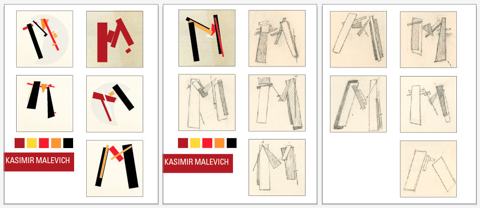
New Behance Project uploaded for Illuminated Letter Project!

Illumination: FINALS


Refinements


Second Round Sketches

Second Round Sketches (First round with word list posted earlier)


Process for Illumination

Artist Bio, Books borrowed from Library, Why I chose Malevich, Tschichold, and Thompson:

I chose graphic designer Bradbury Thompson because I really like his layering of color, how the simplicity of his graphic images make his work so visually interesting. In the pieces that I posted in older blogs, I really like how many different colors he’s able to create by combining the cmyk color system.


“Bradbury Thompson : the art of graphic design” by Bradbury Thompson

“Nine Pioneers in American graphic design” by R. Roger Remington

“Inspirations for graphic design” by Bradbury Thompson


Bradbury Thompson’s formidable career as a graphic designer spans more than fifty years. Hes designed more than ninty stamps marking him the most prolific of american stamp designers. Thompson didnt limit himself to the traditional fine arts in looking for visual inspiration. He has explored and expanded the relationship of type with photography, with primtive and folk art, and even with the evanescent patterns of the performing arts and children’s play. Hes adapted the fine arts to his own use in innovative ways:exploring new combinations of type and image in Westvaco Inspirations: reusing period engravings to illustrate classic american books: illustrationg with old master paintings King James Bible.

He designed over fifty issues of Westvaco Inspirations for Printers, a periodical published by the Westvaco Corporation between 1925, and 1962 as a showcase for its printing papers, with thompson’s direction it became one of the leading avant-grarde publivations in the field, its influence reacing from San Franciso to Milan.

The principles Thompson developed in his work for inspirations and art news were later refined and restated in the books he dsigned in the sixties and seventies- particulary the celebrated Washburn College Bible of 1979.

When Bradbury Thompson began teaching at Yale in 1956, it was really a continuation of the teaching he had been doing by example since 1939. like all designers, he depends on intuition as well as principle, but intuition by definition is innate and cannot be taught. It has been Thimpson’s seach for principles and his generosity in sharing his discoveries that make both his teaching and his work as a designer so remarkable.


I chose suprematist Malevich because I love how he is able to imply depth and dimension through his simple rational, rectangular shapes. I love his warm color palette and wanted to create a drop cap that would imply the same geometric, mechanical usage of line and shape that is so apparent in his paintings.


“Kazimir Malevich and the art of geometry” by John MIlner

“Kazimir Malevich” by Charlotte Douglas

“Kazimir Malevich” by Alison Hilton


The Russian painter Kasimir Malevich (1878-1935) founded suprematism and is credited with having painted the first geometric, totally nonrepresentational picture.By 1913 he had so transformed his material that recognizable imagery had disappeared, though inferences of light, bulk, and atmosphere had not. Later that year he carried abstraction to its ultimate limit: he painted a black rectangle on a white ground. This, the first suprematist work, according to the artist, expressed "the supremacy of pure feeling in creative art."

Around 1913, Malevich confined himself to arrangements of geometric shapes with the goal of suggesting such sensations to the beholder as flight, wireless telegraphy, and magnetic attraction. In 1918 he painted a series of white-on-white suprematist compositions. The following year he had a retrospective exhibition in Moscow and also took over the directorship of the School of Art in Vitebsk, which he renamed the College of New Art.

In 1929 Malevich had a retrospective exhibition at the Tretyakov Gallery in Moscow. During the last years of his life he painted fewer pictures, and those he did were portraits, mostly of his family and friends. He died of cancer in Leningrad and was buried in a coffin that he himself had decorated with suprematist motifs.


I chose typographer Jan Tschichold simply because I just am in love with his work. I think his usage of typography and collaboration with photography is exciting and streamlined in its beauty. I am attracted to his use of the grid to layout his compositions and wanted to imply his past compositions using the first letter of his first and last name.


“Jan Tschichold: master typographer: his life, work and legacy” by Cees W. de Jong

“Jan Tschichold: posters of the avantgarde” by Martijn f. Le Coultre

“Jan Tschichold: typographer and type designer”

“Jan Tschichold: typographer” by Ruari McLean

Jan Tschichold was an important 20th-century German graphic designer who also gave a major impetus to the Swiss school. Jan Tschichold attended the "Akademie for Grafische Künste and Buchgewerbe "in Leipzig from 1919 until 1921. In 1923 Jan Tschichold visited the Bauhaus exhibition in Weimar. Influenced by the new Bauhaus typography, Jan Tschichold began to use serifless typefaces and designed simplified layouts.
In a special 1925 issue of "typographische mitteilungen" entitled "elementare typographie", Jan Tschichold introduced in the form of theses the most important approaches to the new typography design. From 1923 Jan Tschichold freelanced as a commercial graphic artist; his clientele included Insel Verlag publishers.
From 1926 until 1933, Jan Tschichold taught typography at Paul Renners Master Classes for Book Printers in Munich. In 1933 Jan Tschichold emigrated to Switzerland, where he worked for several publishers in Basel and taught at the School for the Applied Arts. In 1946 Jan Tschichold went to London, where he was art director at Penguin Books until 1949. In 1950 he returned to Switzerland. Between 1955 and 1967 Jan Tschichold worked as a design consultant for the Basel pharmaceutical company Hoffmann-La Roche.